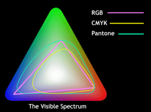
What’s what with RGB, CMYK and Pantone color specs? When to use what, and why, is the purpose for this short article.

For printing, the standard process is CMYK (cyan, magenta, yellow and black). With just these four colors of ink applied in various screen densities, printers are able to produce full color, although in a narrower gamut than RGB. The image quality is determined by halftone screen density, with 300 dots per inch (dpi) the standard. Every press prints differently, and the color and surface of the paper influence outcome and effect.
The most specific and controlled printing process uses custom-mixed Pantone colors using the Pantone Matching System (PMS). Thousands of shades of ink are mixed using fourteen base colors. In the printing trade, custom ink colors are called spot color, since there is a printing plate for each spot of each color. Because Pantone produces printed catalogs of their color system, it is the de facto standard for analog color. One can compare an actual reference swatch to a printed piece, unlike digital color where there is no reference standard since the color appears different on every device.
When to use what
Digital color is always RGB. Traditional four-color process printing is always CMYK. What about matching? RGB colors look different on different screens, platforms, programs. CMYK colors vary by press, press operator, paper stock, paper finish and ink manufacture. Pantone swatches, like any pigment-based color, fade over time.
Don’t be disappointed to learn that matching color from one system to another is almost never possible. For one thing, RGB color is almost always projected, or backlit, with brilliance and intensity only possible when mixing colors of light. CMYK is flatter, sometimes darker, and subject to lighting, paper and pigment. And Pantone only counts as a reference when you’re comparing printed swatches against printed ink.
For critical color match on printed pieces, Pantone spot colors are unbeatable. Metallic and neon colors, certain shades of blue, red and orange, and subtle greys are always best printed with PMS spot color. When a color?(on a package, for example) has to be an exact shade, ink is formulated to match that?specific color and used to print that spot. The CMYK process cannot deliver the consistency or intensity of a spot color but printing costs multiply with each spot color used.
The short answer: They’re not interchangeable, they’ll never exactly match (and most people have some degree of color blindness anyway).
- RGB for digital and most inkjet printers
- CMYK for commercial lithography
- Pantone for absolute match with printing inks
Want to read more? Here are three links that I found useful

