Any good marketing content program should make maximum use of every piece of content. Maybe you already promote your content pieces on social media (and if you don’t you should). But finding unique ways to adapt marketing content for social can be a challenge. Enter the tried-and-true carousel post.
Most brands are locked in on text and image posts. And if you’re not including images, consider this: relevant images can boost reach by 15-20%. Personalized images can increase engagement by 45%. There’s a reason 48% of all posts include an image.
But raising your LinkedIn game means investing in infographics, videos and yes, carousel posts. While overall, carousel posts have decreased in engagement over the last year, they’re still the go-to format for maximizing reach with 1.6x engagement over standard posts. And the optimal length is 12 slides (interestingly enough, less than 5 slides results in a 35% decrease in reach).
LinkedIn used to offer a carousel template, but that was shelved at the end of 2023 (I guess there can be too much of a good thing, which is why they still offer this format in paid ads). However, you can still create your own carousel posts as a pdf and upload it as media (getting the same effect).
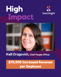
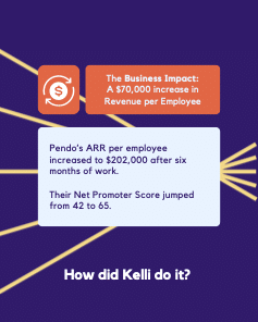
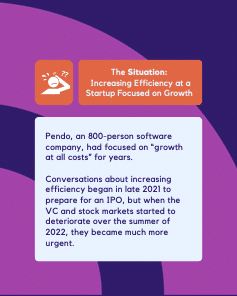
Carousel posts offer a unique way to adapt marketing content into a more engaging medium. Have an ebook about top ransomware threats…consolidate it into a carousel post. Have a compelling customer case study…consolidate it into a carousel. You get the point. Here’s a sample post from one of our clients, Searchlight:


The basic approach? Each slide has space for a small amount of text and an image or two. These can be posted to a company LinkedIn page and readers can scroll through the slides in their LinkedIn feed. Since each slide can only fit a small amount of text, content pieces like white papers or blog posts can usually be condensed into 12 slides with little work. These can increase your social engagement, and if you put a link in a slide or two, it can refer traffic back to your website.
Like all content pieces, there are a few tricks to making carousel posts engaging. Consider these tips:
- Transform Existing Content: As discussed, existing content can usually be turned into a carousel post with a little extra work. There’s nothing wrong with coming up with novel content purely for a carousel, but repurposing existing content offers the best results for the least amount of effort.
- Focus on the Titles: Each slide should have a title and a reader should be able to get the main point of the slides without reading more. Rather than a preview of what the slide will say, each title should make a point. The rest of the text on each slide expands on that point (briefly).
- Keep it Short: Like PowerPoint slides, less text is always better. Limit the body text on each slide to about 60 words and split it up into bullet points if possible.
- Make it Visual: Design an attractive background for the slides or use templates you can find online (in tools like Canva). Include images in place of text wherever possible.
- Share it Widely: Share the final post to your company LinkedIn page and encourage employees to reshare it. If you interviewed someone or collaborated with a customer or partner when creating the original content that the slides are based on, ask them to repost as well. The more the better.
- Learn and Iterate: Once you’ve published a few carousel posts, look at the LinkedIn analytics for each of them and compare. Did one do better than the others? What was different about it? Take notes on what seems to make slides get more engagement and do more of those things in future ones.
Staying fresh with your social content marketing is a big task, and carousel posts might be just the change your team’s been looking for. Need help creating these posts, other content pieces, or not sure what to do next with your content program? Voxus can help with that. Let’s chat.

